
Pareto analysis: A simple tool to prioritize efficiency improvements
Operational efficiency is about more than making your plant or office more productive. It’s also about better decision-making. How do you decide if action A or B is going to have more impact on your business?
This is where Pareto analysis comes in. Known as the 80-20 rule or the Law of the Vital Few, this simple tool is based on a basic notion: 80% of effects are due to 20% of causes.
In other words, a small number of factors is typically responsible for most issues or challenges. “Pareto analysis allows us to use data to find ‘quick wins’ faster—and with less cost to the organization—while identifying areas to improve that have a disproportionately positive impact,” says Manuel Gogolin, Co-Lead Impact, Growth and Productivity at BDC.
A small number of factors is usually responsible for a disproportionate number of issues.
Manuel Gogolin
Co-Lead Impact, Growth and Productivity, BDC
How to use Pareto analysis to prioritize actions
“A concentration of things typically fight for our attention. We want to make sure we’re prioritizing the actions that are going to lead to the biggest improvements,” Gogolin says.
He frequently uses Pareto analysis as a data-based way to help entrepreneurs decide which actions to prioritize when addressing quality management and other challenges.
Examples of Pareto analysis
He sees the 80-20 rule in action in a surprisingly wide range of business situations. Some possible examples:
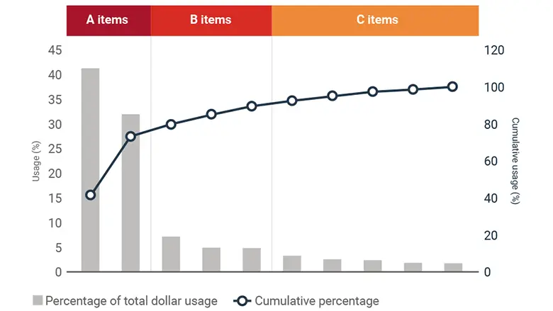
- 20% of inventory items often account for 80% of a company’s revenues
- 20% of customers bring in 80% of revenue
- 20% of employees are responsible for 80% of sick leave
- 20% of the sales force generates 80% of sales
- 20% of products are responsible for 80% of rework or customer complaints
The 80-20 ratio is a rule of thumb, not a hard-and-fast number. “The actual proportion in any given situation could be 70-30 or 90-10,” Gogolin says. “What’s key is the idea that a small number of factors is usually responsible for a disproportionate number of issues.”
In the parlance of efficiency experts, Pareto analysis helps you focus on the “vital few” and ignore the “trivial many.” The process involves four key steps.
1. Get data
Data is at the heart of operational efficiency. And Pareto analysis is no different. It’s important to track data relevant to your business in order to gauge current performance and monitor improvement. The specific data to track varies by the company and its challenges—for example, bottlenecks, rising costs or wasted space, resources or effort.
You can systematically identify such challenges using lean methodology and monitor the data using technology, such as KPI dashboards or specialized manufacturing applications.
“A lot of companies are bad at tracking data,” Gogolin says. “The first step is to start tracking information on where deficiencies are occurring.”
For example, if rework numbers are high, you can track data related to the root causes of each rework request, which department is responsible and the process it involves. For the data to be useful, it must be collected over a meaningful period of time (which, again, varies by the situation).
Pareto chart example
2. Chart the numbers
The second step is to put the data on a chart so you can visualize it. The most suitable type of chart is a histogram, also known as a bar chart. This is a chart showing each element as a bar representing its frequency. For example, after two months of data tracking, you may find that:
- 100 rework requests were due to paint-related issues
- 75 were because of material defects
- 20 were caused by hardware failures
- 15 were due to poor communication with clients
- 10 were the result of other factors
This information should be arranged on a chart from highest to lowest frequency. The highest frequency cause (paint-related issues) would be the first bar at the left of the chart, followed by material defects and so on (see chart below).
Pareto chart: Rework requests
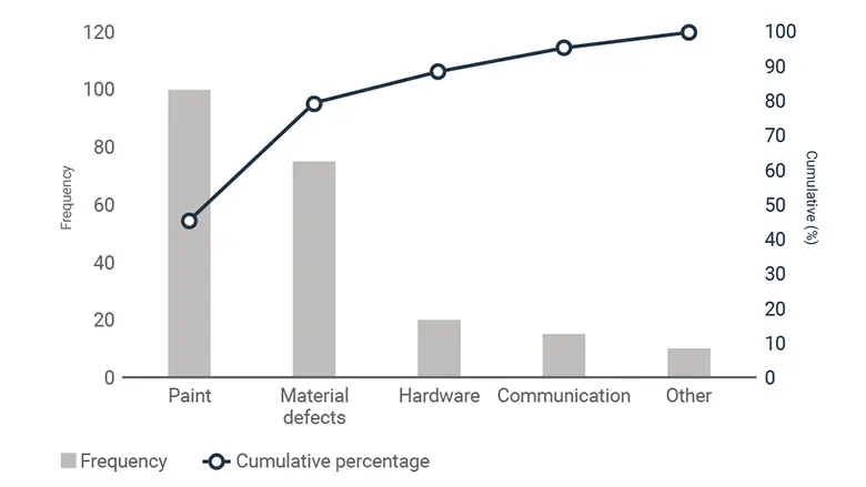
3. Add a cumulative percentage line
The final element to add is a cumulative percentage line (see red line in chart above). This is a line showing the cumulative percentage of the occurrences of the items on the chart.
We want to focus on the vital few and ignore the trivial many.
4. Identify priority areas for action
Finally, identify the elements that when combined make up 80% of the events you are examining. In the rework example above, paint and material defects together make up 175 out of 220 total rework requests. That’s just under 80% of the total.
The business would then use this information to prioritize the painting process and material defects as focus areas for an action plan or Kaizen blitz to reduce the rework volume. “We know that if we fix the priority areas, that’s going to deal with 80% of our problems,” Gogolin says. “We want to focus on the vital few and ignore the trivial many.”
Did you enjoy this article?
Read our free guide to learn more about the basics of operational efficiency or fill out a form to start talking with one of our experts and get started on your continuous improvement journey.