Button
Quick links
Overview
A button is a clickable element that allows the user to initiate an action on the page. The label is used to communicate a call to action to the user and must tell the user what will happen when interacting with it.
When to use
Use a button to call the user to action and interact with the page. A button is mainly used to change page, but not only. It can be used to download a document or submit a form for example. A page should not have more than one primary button.
Button variant
Each variation has a specific function, and its design serves to communicate that very function to the user. It is, therefore, very important that its use be consistent across all platforms so that the right message is sent to the user.
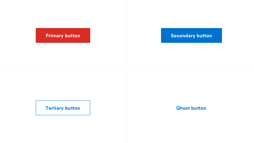
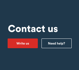
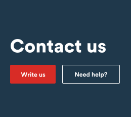
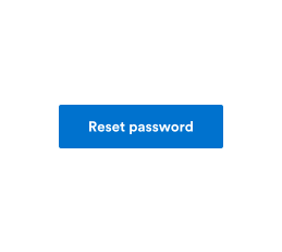
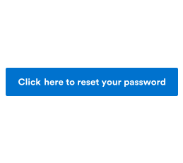
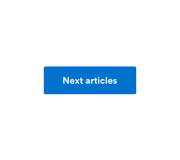
Primary button
For the main action of the page. The main button should not be used more than once per page (excluding modal or side boxes). If it ever appears more than once on the page, it should always serve the same action and therefore have the same label.
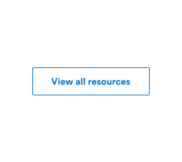
Secondary button
Usually, the second button is only used when a main button is already present on the page, although it can also be used in a form to go from one step to another. It is also possible to have more than one secondary button on the same page.
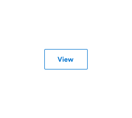
Tertiary button
Use for actions of lesser importance than the secondary buttons, or for independent actions like “Load more”. The tertiary button can also be used in conjunction with the primary button.
Ghost button
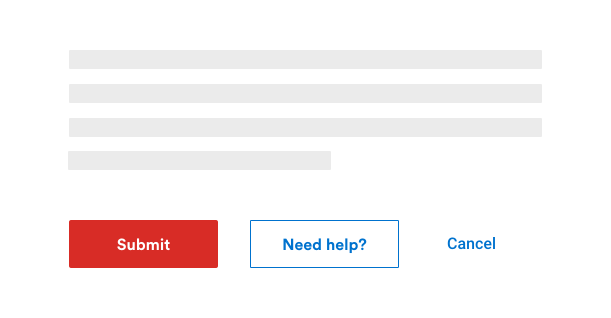
For the least important actions. Often used in conjunction with the primary or secondary button. For example, if the primary or secondary button is used for forward actions, the ghost button is used for backward actions like "Back" or "Cancel". It is also used so that it does not visually compete with a more important action.
Formatting
Anatomy
The text label is the most important element of the button. It communicates the action that will be taken when the user interacts with it. In a contained button, the label is always centered. The text label of all buttons must always be sentence case.
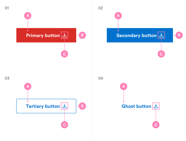
01. Primary button
A. Text label
B. Container
C. Icon (optional)
02. Secondary button
A. Text label
B. Container
C. Icon (optional)
03. Tertiary button
A. Text label
B. Container
C. Icon (optional)
04. Ghost button
A. Text label
C. Icon (optional)
Size
The size of the buttons can change depending on its purpose or where it is used.
Their names (below) depend on their use.
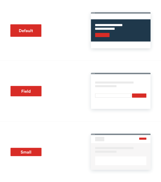
Default
Use as primary call to action for page actions.
Field
Use when buttons are paired with input fields.
Small
Use when there is not enough vertical space for the default or field-sized button.
Button with icon
To help the user understand a specific action, an icon can be added to the button, either before or after the label, depending on the need.
- Use a 20px icon within a 24px box.
- Icons must always be the same colour value as the text within a button.
- The icon refers to the meaning of the label.
- Icons are distinguished by their outline shape.
Icon before the label
The icon refers to the meaning of the label.
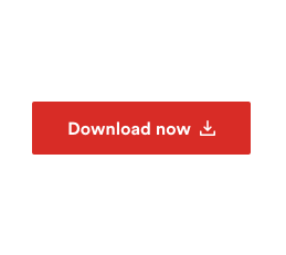
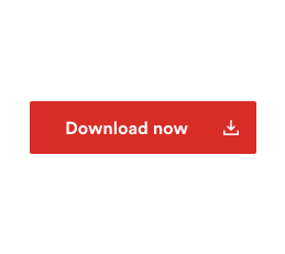
Icon after the label
The icon is used to indicate the nature of the interaction. For example, an external link icon indicates that the user will leave the site, etc.
Icon alone
Used for icons whose meaning is clearly known by the users (e.g.: Search), the label can be omitted.
Do centered the group forming the label and the icon.
Do not separate the text label from the icon, the two always go hand in hand.
Emphasis
It is not mandatory to use the buttons in their order of importance. A secondary button does not have to be used second and so on. It all depends on the context of the page. The most important thing is to keep a good visual hierarchy between the buttons in the pages.
A single, high-emphasis button
As general rule, a page should contain a single high-emphasis button that is clearly identifiable and stands out from all other actions on the page. The purpose of this button is to attract the user’s attention.
Multiple button emphasis
A high-emphasis button can be accompanied by a medium-emphasis or low-emphasis button for actions of lesser importance. It is however important to keep in mind that only buttons that are related to each other should be grouped together.
- Use only one primary button per button group.
- The button group can be right or left aligned.
- If possible, limit the number of buttons in the group to make it easier to identify the functions.
If a layout requires several actions, like for filters, don't hesitate to use low-emphasis buttons like tertiary buttons or ghost buttons.
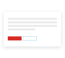
Use high-emphasis and low-emphasis buttons in a group.
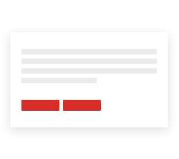
Do not use two high-emphasis buttons in a group.
Alignment
Refers to the position of the button on the page, window or container. There are three types of alignment: left, center and right. The alignment can vary, depending on the position on the page, where it is used, and several other factors.
More often than not, it is the left alignment that is favored. Why is this so? Because it is the classic reading direction of the user and it is better to place the button where you know you will get the user's attention. On the other hand, in a modal, or when the user goes through several steps, for example, the button will traditionally be aligned to the bottom right. It is also possible for the button to be right-aligned in some components.
Sometimes, a button can take the whole width of the container, and this often happens in the case of a mobile.
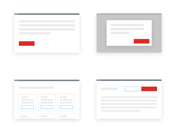
In editorial pages or with a lot of content
The buttons are aligned to the left of the page (reading direction). This is also the case for form buttons that are inserted in content pages.
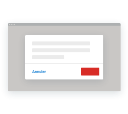
In modals or where a user progresses through a series of steps
The buttons are aligned to the right, with the main action (“Next”, “Confirm”, “Submit”, etc.) located furthest to the right.
In a full width page (without left menu)
The button should follow the alignment of the content that precedes it. For example, if the title and the front content are aligned centered, the button should follow the same alignment.
Do align the primary button to the left in an informational page.
Do not position the primary button after the ghost button.
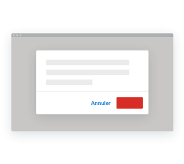
Align the buttons to the right in a modal or utility interface.
Do not have different alignments for a button group.
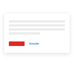
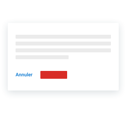
Button group
A button group refers to several buttons associated together and can be a very useful way to align buttons that are related to each other. Logically, a button group should be used according to the rules of usage and importance. Keep in mind that too many buttons can overwhelm and confuse a user, so it should be avoided.
It is not necessary to use the buttons in their order of importance. For example, instead of using a secondary button with a primary button, it is recommended to use a tertiary button with a primary button or a ghost button instead, simply because the visual weight of the secondary button is too strong with a primary button.
Some basic rules
- Use only one primary button per button group.
- The primary button can be combined with one (or more) secondary or tertiary buttons.
- Preferably, do not use too many secondary buttons in a group. Instead, use the tertiary or ghost button format, both of which are less distracting.
- The button group can be right or left aligned.
- If possible, limit the number of buttons in the group, to make it easier to identify the functions.
Apply the same width to all buttons in a group.
Do not have buttons of different widths.
Text labels
The button label is, without a doubt, the most important element of the button. It is used to communicate to the user the action that will be performed when interacting with the button. The wording of the button must be clear and predictable.
A button should always be clear, concise and give enough context. It is recommended to use the verb + noun/adverb formula. However, there may be exceptions, as in the case of common and simple actions, like “Done”, “Cancel”, “Add” or “Delete”.
A button should never be longer than 37 characters. However, there is an exception to this rule in situations where the length of the button could cause problems with a compact UI, such as on mobile. The button should never have a negative impact on the visual rendering. But otherwise, the verb + noun/adverb formula remains the best practice.
Do use concise, easy to scan, and clear button labels to indicate the next action to the user.
Do not use long, redundant button labels. Drop unnecessary words for a more concise label.

Do use sentence-case capitalization.

Do not use title case capitalization or all caps.
Do use the verb + noun/adverb formula in buttons whenever possible.
Do not use only a one-word label if not precise enough.
Do use label on one line.
Do not use line break.